Best Startup Landing Page Examples (With Breakdown)
Study 12 high-converting startup landing pages. Full breakdown of headlines, value props, social proof, CTAs, and design patterns that drive signups.
💡 Key Takeaway
Study 12 high-converting startup landing pages. Full breakdown of headlines, value props, social proof, CTAs, and design patterns that drive signups.
A startup landing page has one job: make the value proposition unmistakably clear and reduce friction to conversion. Most landing pages fail because they're written for the company, not the customer -- they describe what the product is rather than what it does for the person reading it.
These 12 real startup landing pages are worth studying. Each one solves the core messaging challenge differently.
1. Stripe -- "The new standard in online payments"
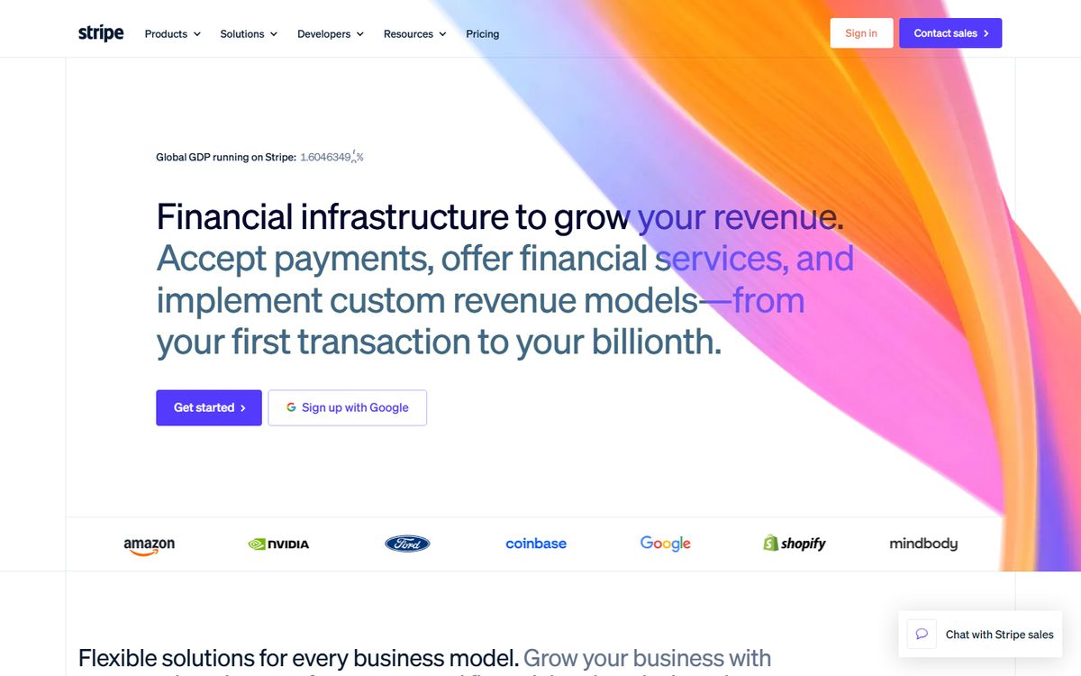
What it does right: Stripe's hero section is one of the most copied in tech for a reason. "Financial infrastructure for the internet" replaced by more concrete versions over time, but the current iteration -- clean, code-first design with a simple "Start now" CTA -- signals everything about who Stripe is before you read a word.
Breakdown:
- No-friction primary CTA: "Start now" or "Create account" -- not "Request a demo" or "Contact sales." Stripe invests in self-serve onboarding so the landing page can convert directly.
- Social proof by volume: "Millions of companies" is a powerful social proof signal even without naming names. When named logos appear (Amazon, Google, Salesforce), they're used contextually -- not as a flat logo wall.
- Technical and business value layered: The page speaks to developers (it works with their stack) and business decision-makers (it scales as you grow) without alienating either.
The conversion mechanic: Email-first signup. Stripe's form is a single email field. Every field you add reduces conversion rate. Stripe learned this early.
2. Notion -- "The connected workspace where better, faster work happens"
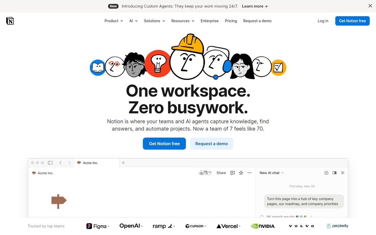
What it does right: Notion's homepage has evolved from "write, plan, collaborate" (a feature list) to "The connected workspace where better, faster work happens" (an outcome statement). The shift from features to outcomes is a masterclass in landing page copywriting maturity.
Breakdown:
- Persona toggling: Notion's homepage shows different use cases for different personas -- engineering teams, product managers, designers, HR -- in a rotating feature showcase. This handles the "for who?" question without requiring separate landing pages.
- Visual product preview: The actual product interface is prominent in the hero. People need to see what they're signing up for. Abstract illustrations lost to real product screenshots years ago.
- Template-first onboarding: The "Get started free" CTA leads to template selection -- letting new users experience value before they've written a single word.
The conversion mechanic: Free forever tier with generous limits. The landing page doesn't need to convince you to pay -- it just needs to convince you to start.
Averi automates this entire workflow
From strategy to drafting to publishing — stop doing it manually.
3. Linear -- "The issue tracking tool you'll enjoy using"
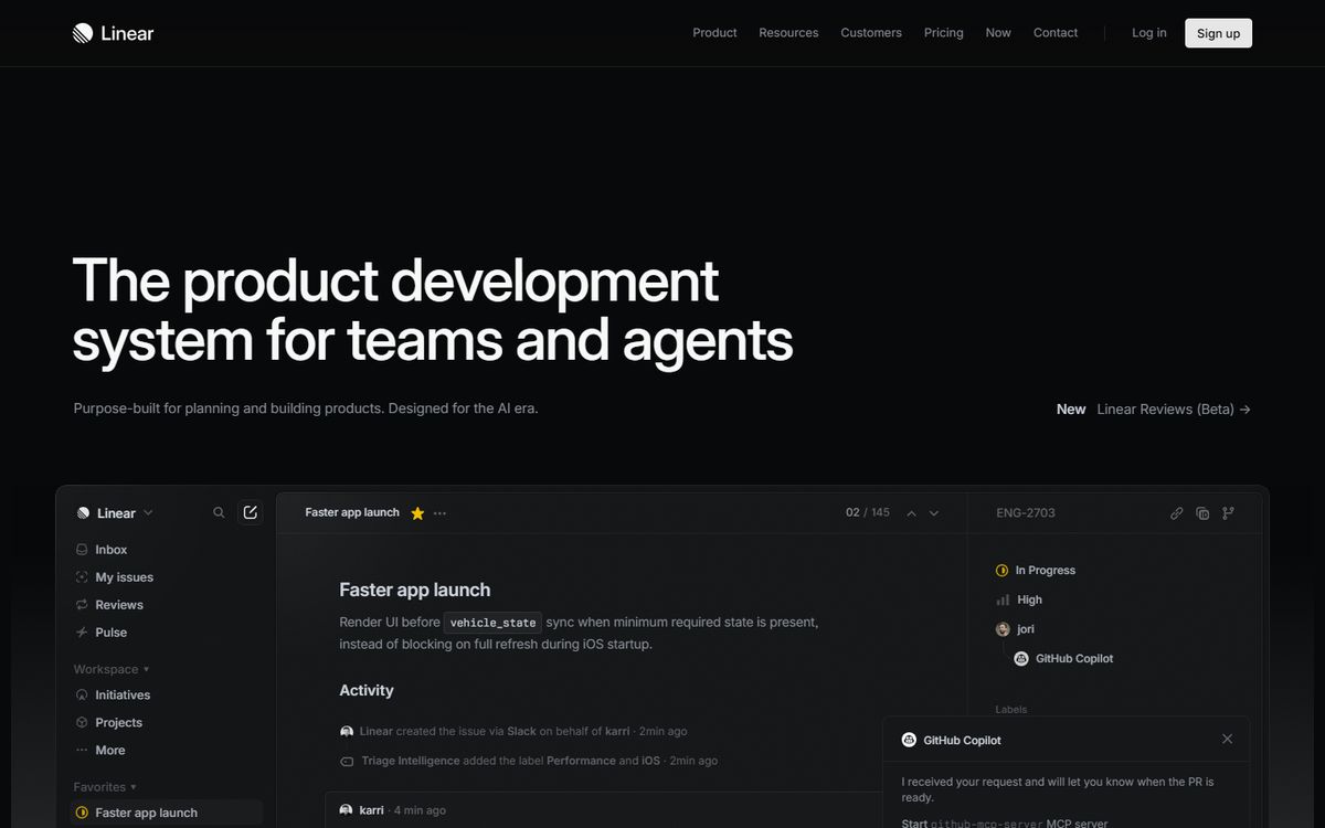
What it does right: Linear's tagline is brutally specific and brutally honest. "The issue tracking tool you'll enjoy using" is a direct shot at Jira -- the dominant, universally-disliked competitor. The entire page is built around the promise that software development tools don't have to be painful.
Breakdown:
- Competitor positioning without naming competitors: Linear never says "better than Jira" -- but every engineering team reading it thinks "they mean Jira." Implicit comparisons can be more powerful than explicit ones.
- Speed as a feature: Linear's page is fast. Deliberately, obsessively fast. The product promise (fast, clean project management) is demonstrated by the experience of the page itself.
- Design as messaging: Linear's aesthetic -- dark, minimal, precise -- signals something about the product before you've read a headline. Design and copy deliver a unified message.
The conversion mechanic: Free tier, no credit card required. The page removes every possible objection to trying it.
4. Loom -- "Say it with a video message"
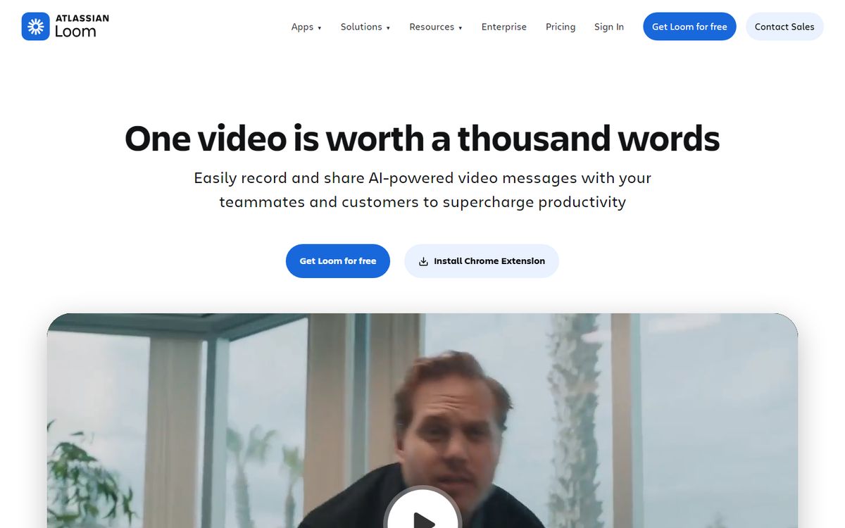
What it does right: Loom's hero demonstrates the product in the hero section -- you see a screen recording being made before you understand what Loom is. The format is the message. Showing > telling.
Breakdown:
- Demo in the hero: An embedded Loom video showing someone recording a Loom explains the product more effectively than any copy could. Visitors get it immediately.
- Quantified value: "Loom videos are watched an average of 72% through." Specific numbers outperform vague claims every time.
- Use case breadth: Loom's page addresses multiple use cases (feedback, presentations, tutorials, async updates) to show range without overwhelming with options.
The conversion mechanic: Browser extension installation. Getting users to install Loom is easier than getting them to log in -- and once installed, it creates habitual use. The CTA is "Install Chrome Extension" or "Download Loom," not "Sign up."
5. Calendly -- "Easy scheduling ahead"
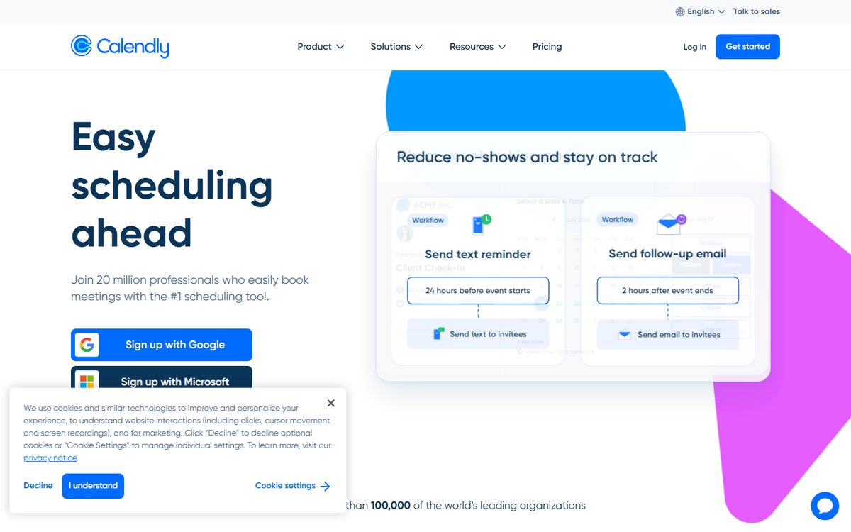
What it does right: Calendly's simplicity is deceptive. "Easy scheduling ahead" sounds generic, but it's paired with a visual that shows the actual scheduling flow -- which makes the promise concrete instantly. The product is simple, so the page is simple.
Breakdown:
- Pain-before-solution structure: Calendly's secondary copy acknowledges the pain ("The hassle of back-and-forth emails to find a time is real") before presenting the solution. Naming the pain builds empathy and urgency.
- Free tier emphasis: Calendly prominently features their free tier because they know the growth loop is viral -- once someone receives a Calendly link, they're likely to become a user themselves.
- Word-of-mouth built into the product: "Powered by Calendly" at the bottom of scheduling pages drives organic landing page traffic. The product markets itself.
The conversion mechanic: Freemium with viral loop. The landing page doesn't need to do all the work -- the product creates its own acquisition channel.
Build your content engine with Averi
AI-powered strategy, drafting, and publishing in one workflow.
6. Figma -- "Build better products as a team"
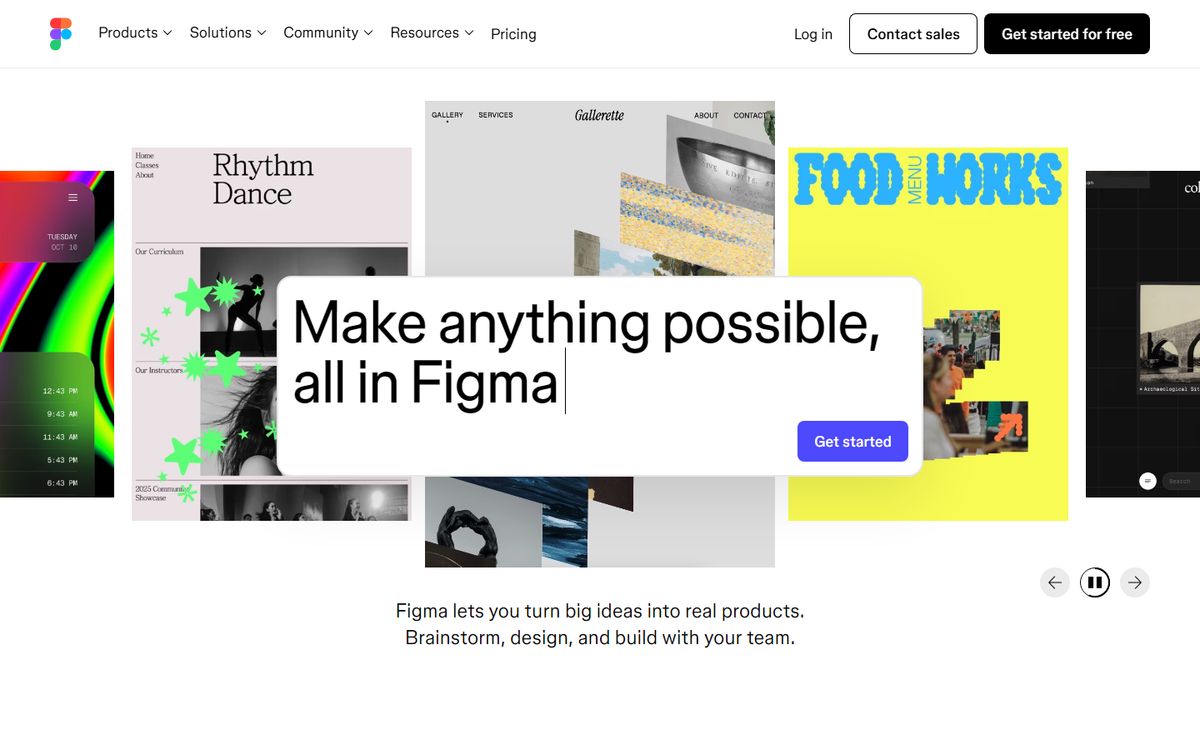
What it does right: Figma's pitch is fundamentally about collaboration -- "as a team" is the core differentiator from Sketch and Adobe XD. Everything on the landing page serves that collaboration message: multi-cursor demos, team libraries, comment threads visible in product screenshots.
Breakdown:
- Video demo in hero: Figma's hero video shows real-time collaboration -- two cursors editing the same design simultaneously. This single clip communicates the product's key differentiator in 5 seconds.
- Testimonials as proof of claim: Customer quotes don't just say "Figma is great" -- they specifically validate the collaboration promise. "Our entire team adopted it in one week" serves as proof of the "as a team" claim.
- Education ecosystem mention: Figma prominently features its community, plugins, and educational resources. The product is positioned as an ecosystem, not just a tool.
The conversion mechanic: Free forever for 3 projects. Enough to get hooked, constrained enough to upgrade.
7. Superhuman -- "The Fastest Email Experience Ever Made"
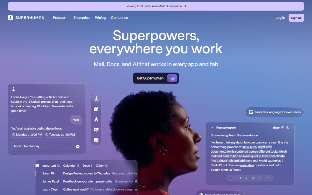
What it does right: Superhuman is $30/month for email -- an audacious pricing decision that requires equally audacious positioning. "The Fastest Email Experience Ever Made" isn't just a headline; it's a measurable promise. The page exists to justify the price before conversion.
Breakdown:
- Scarcity and exclusivity (historical): Superhuman famously required an interview to join initially. The landing page reflected this -- a waitlist, not a sign-up form. This exclusivity created intense desire in early adopters.
- Specific speed claims: "Superhuman users reach Inbox Zero twice as fast." A specific, verifiable claim earns more trust than generic superlatives.
- Power user signals: The page is full of keyboard shortcut previews, command palette demos, and other signals that say "this is for serious email users." This self-selects for high-value customers willing to pay premium pricing.
The conversion mechanic: High-friction (for a reason). The application or waitlist flow filters for committed users and reduces churn from casual signups.
8. Webflow -- "The website experience platform"
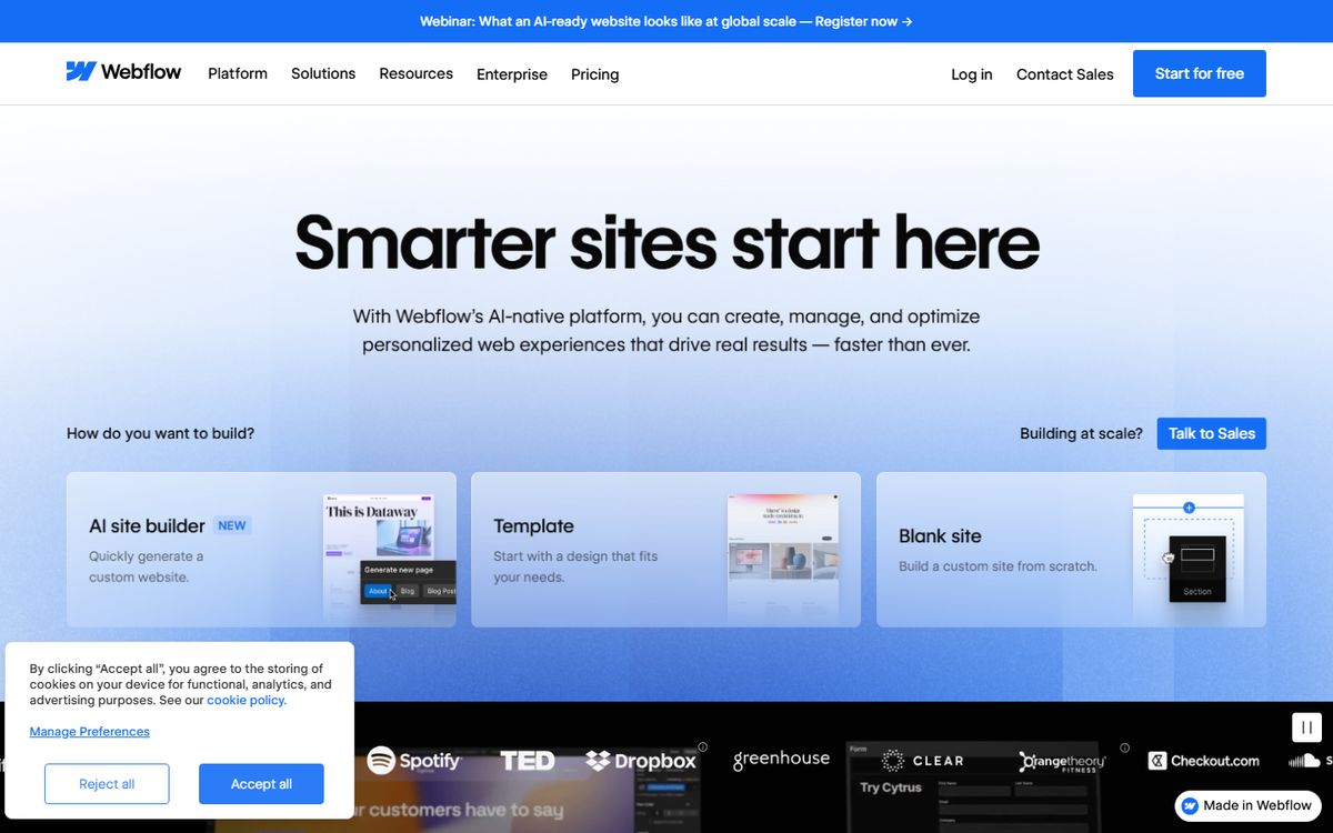
What it does right: Webflow's position has evolved -- from "build without coding" to "the website experience platform." The shift acknowledges that Webflow is now more than a no-code tool; it's a CMS, hosting platform, and marketing-site infrastructure play.
Breakdown:
- Audience segmentation on the homepage: Webflow shows different pathways for different users -- designers, marketers, developers -- with visual hierarchy that helps each persona self-identify and find their use case.
- Enterprise social proof: AWS, DELL, Dropbox, Discord logo wall signals that enterprise teams trust it, which de-risks the evaluation for mid-market buyers.
- Education moat mention: "Join 4 million designers" is a social proof number, but it also signals an ecosystem -- a community, a job market, a set of professional skills worth developing.
The conversion mechanic: Free plan for building, paid plan for publishing to a custom domain. The free plan lets people build deeply before committing.
Ready to put this into practice?
Averi turns these strategies into an automated content workflow.
9. Slack -- "Made for people. Built for productivity"
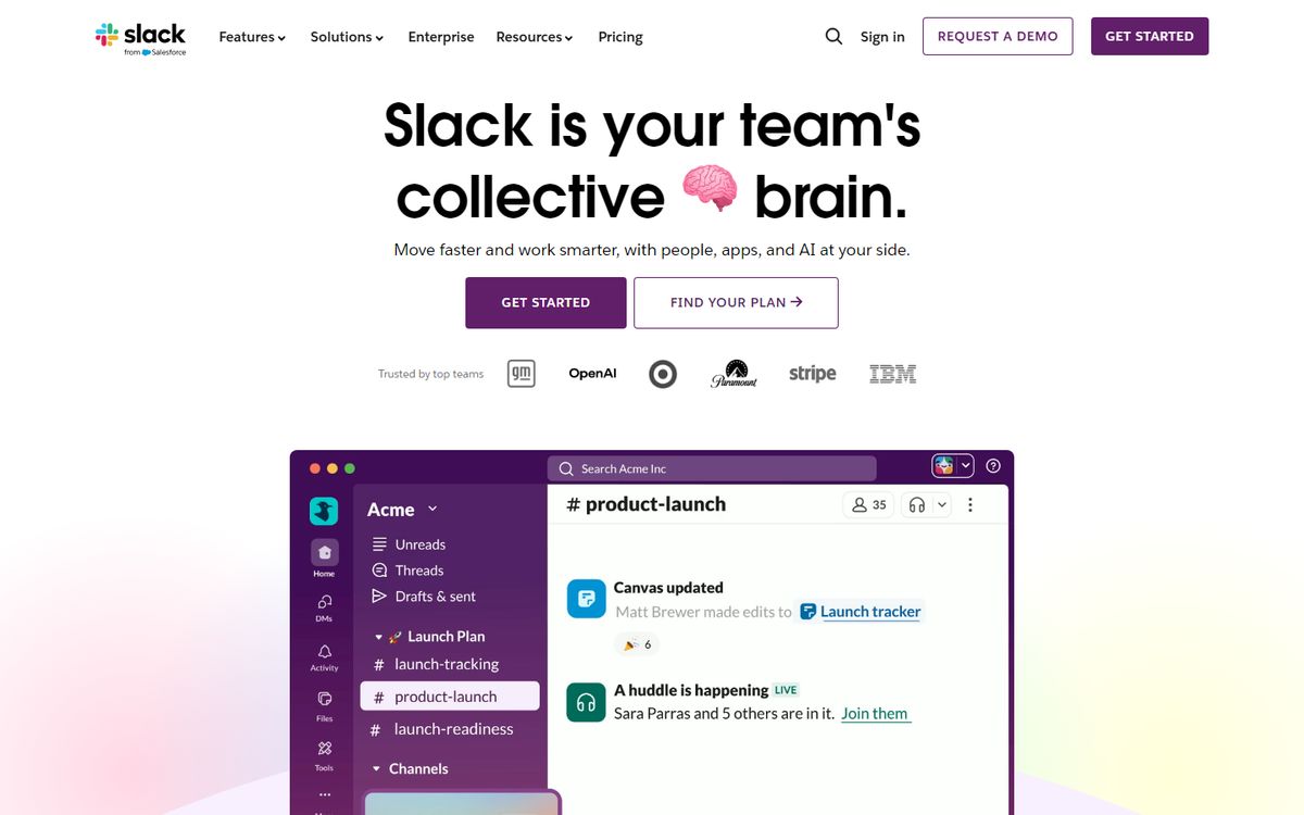
What it does right: Slack's homepage is remarkably human for enterprise software. The copy talks about people, not features. "Made for people" in the headline is a signal that Slack has always prioritized user experience over IT department requirements -- a core part of their bottom-up enterprise adoption story.
Breakdown:
- Conversational copy tone: Slack writes landing page copy the way a smart friend would explain the product. No enterprise jargon. This made them unusual when they launched and became a template for modern SaaS copywriting.
- The work/life integration message: Slack's secondary messaging consistently addresses work-life balance -- not just productivity but how working better feels different. This emotional resonance is what drove viral word-of-mouth.
- Integration depth as social proof: "2,600+ apps" is social proof through ecosystem size -- the message is "everyone else is already here."
The conversion mechanic: Free forever with usage limits (message history cap). The free plan creates team-level adoption before any budget conversation happens.
10. Framer -- "Ship stunning sites. Way faster."
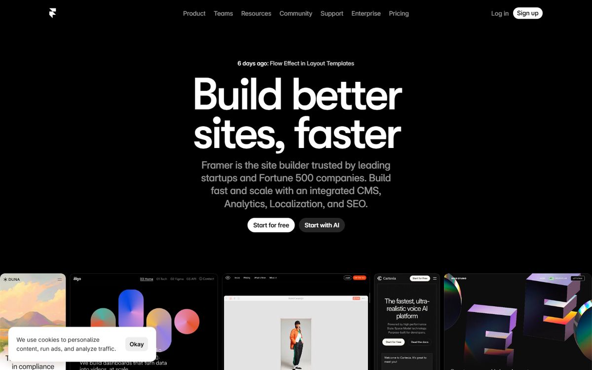
What it does right: Framer's recent positioning as an AI-assisted web design tool is reflected in a landing page that is itself a demonstration of what Framer can create -- animated, visually sophisticated, fast. The medium is the message.
Breakdown:
- AI as the lead feature: Framer now prominently features its AI site generation as the primary entry point -- "Generate a site from a prompt." This is a bet on the direction of the market rather than the current state.
- Speed-to-publish emphasis: "Ship in days, not months" speaks directly to the pain of design bottlenecks for fast-moving startups.
- Template gallery as demonstration: Framer's template showcase on the landing page shows what's possible -- visual aspiration as conversion motivation.
The conversion mechanic: Free plan with Framer branding. The branding creates organic awareness as visitors to Framer-built sites see the footer.
11. Typeform -- "Build beautiful, people-friendly forms"
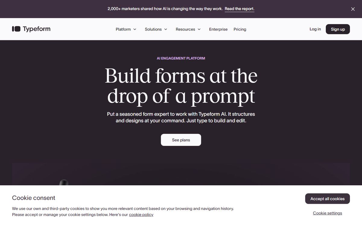
What it does right: Typeform's positioning has always been about the emotional experience of filling out forms -- "people-friendly" is a direct dig at every boring survey tool that came before it. The landing page embeds an interactive demo form so you can feel the difference before reading about it.
Breakdown:
- Interactive demo in-page: Rather than showing a screenshot, Typeform's landing page often includes an embeddable form example. You experience the product in the act of evaluating it.
- Use case diversity: Typeform surfaces use cases -- research surveys, lead gen forms, quiz funnels, product feedback -- to show range without leading with features.
- Emotional language: "Beautiful" and "people-friendly" are rare adjectives in B2B software. Typeform's decision to use them is deliberate positioning: this product respects the humans who use it.
The conversion mechanic: Free tier for basic usage. The brand premise (forms people enjoy filling out) increases completion rates for lead gen forms, creating immediate demonstrable value.
12. Notion Calendar (formerly Cron) -- "Manage time. Get more done."
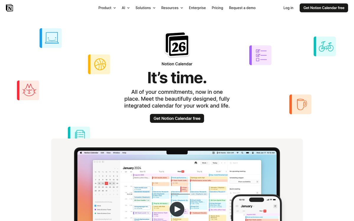
What it does right: When Notion acquired Cron and relaunched as Notion Calendar, the landing page made a simple, elegant argument: your calendar should integrate with where your work lives. The value proposition is frictionless for existing Notion users and compelling enough to attract new ones.
Breakdown:
- Integration as core value prop: "Notion Calendar connects your meetings to your Notion docs." The landing page leads with the integration benefit, not calendar features. This is feature-benefit translation at its best.
- Platform ecosystem leverage: Notion Calendar benefits from Notion's installed base. The landing page is partly directed at people who already know and love Notion -- a much warmer audience than cold prospects.
- Minimalist design that signals quality: Less copy, more white space, one clear CTA. Restraint in landing page design often converts better than abundance.
The conversion mechanic: Free for Notion users. The free positioning maximizes activation from Notion's existing user base.
What These 12 Pages Have in Common
1. They lead with an outcome, not a feature. "The fastest email experience" is an outcome. "Email with keyboard shortcuts and AI" is a feature list. Outcomes convert; features inform.
2. They show the product. Screenshots, embedded demos, videos, interactive examples -- the best startup landing pages assume that seeing the product is more convincing than reading about it.
3. They reduce friction to zero. Every unnecessary form field is a conversion killer. The best pages ask for the minimum: an email address or a Google sign-in. Credit card entry is eliminated from free-tier CTAs.
4. Their CTAs create value, not commitment. "Start free," "Get started," "Try it free" -- not "Request a demo" or "Contact sales" (unless enterprise-required). The CTA should feel like a gift, not a transaction.
5. They use social proof contextually. Logo walls are everywhere. What works is contextual proof: the quote that validates the specific claim you just made, the customer number placed right before the CTA, the logo of a company your prospect respects embedded in the use case that matches theirs.
Further Reading
Frequently Asked Questions
Should the headline be about features or benefits?
Benefits almost always outperform features in headline position. The exception is when the feature is so novel that naming it creates immediate desire ("AI-generated designs in 10 seconds"). In practice: test both, but start with the outcome your user most wants.
How long should a startup landing page be?
Long enough to answer every question a skeptical buyer would have, and no longer. Early-stage startups with simple products often convert best on short pages (under 500 words). Products with longer sales cycles or higher price points typically need more educational content to justify the conversion.
Do landing pages need video?
Video significantly increases conversion rates when it demonstrates the product in action. Loom's hero video showing a screen recording being made converts better than any static alternative could. The key: demo video over brand/aspirational video. Show, don't tell.
How important is page speed for conversion?
Extremely. Linear built a fast page as a product statement and a business decision simultaneously. A 1-second delay in page load time reduces conversions by approximately 7% (Akamai research). For landing pages, every millisecond matters.
How often should a startup redesign its landing page?
Never redesign -- iterate. Run A/B tests on specific elements (headline, CTA copy, hero image, form length) rather than wholesale redesigns. Build a testing cadence of one experiment per week, and let data drive changes. The best startup landing pages are the result of hundreds of small tests over months and years.
Explore More
- 📋 Template: Landing Page Copy Template
- 📖 Guide: How to Write Landing Page Copy That Converts
- 📖 Definition: What Is a Landing Page?
- 📋 Template: On-Page SEO Checklist
- 👤 Guide: Content Marketing for Startup Founders
- ⚔️ Comparison: Averi vs Writer: AI Content for Startup Teams
- 📖 Guide: How to Build a Content Team on a Startup Budget
- 📖 Definition: What Is a Comparison Page?
Related from our blog
How to Build an AI Content Engine That Grows Your Startup →
Build a system that turns strategy into published content.
The 2026 Startup Content Playbook →
Budget-specific content strategies for every stage.
Content Marketing ROI: Real Numbers from Real Founders →
Actual ROI data from startups investing in content.
From the Averi Blog
Start Your AI Content Engine
Ready to put this into practice? Averi automates the hard parts of content marketing — so you can focus on strategy. Join 1,000+ teams already using Averi.
Related Resources

Landing Page Copy Template
Write landing pages that convert. This template covers headline formulas, value propositions, social proof placement, objection handling, and CTA optimization.

Content Marketing for Startup Founders
You're building a product AND need marketing. This guide shows startup founders how to build a content engine that runs without constant attention.

Best SaaS Blog Post Examples (With Analysis)
Study 15 exceptional SaaS blog posts and learn what makes them rank, convert, and engage. Includes structure analysis, SEO breakdown, and takeaways you can steal.

Best Content Marketing Strategy Examples from Startups
See how 10 startups built content engines that drove real growth. From HubSpot to Notion to Buffer — full strategy breakdowns with metrics and lessons.

Best B2B Email Marketing Examples
Study 15 B2B emails that actually get opened, clicked, and converted. Covers welcome sequences, nurture drips, product updates, and newsletters with full analysis.

Best Thought Leadership Content Examples
Study 10 pieces of thought leadership that built brands and careers. Analysis of what makes them compelling, shareable, and authority-building.